
Skyler'ra Garcia
Data Analyst | Reporting Analyst
Google Sheets
Tracking Employee Attrition
This project analyzes employee attrition by retirement and termination through an interactive dashboard that highlights workforce trends, department-level patterns, and key factors influencing employee turnover.


Power BI
Iris Flower Analysis
This project analyzes measurements across the Iris flower dataset species using an interactive dashboard to compare petal and sepal dimensions through filtering, visualization, and trend analysis.
Excel
Penguin Body and Flipper Length
This project analyzes the Palmer Penguins dataset to explore relationships between penguin body measurements using statistical analysis, correlation testing, and linear regression.

Google Sheets
Tracking Employee Attrition
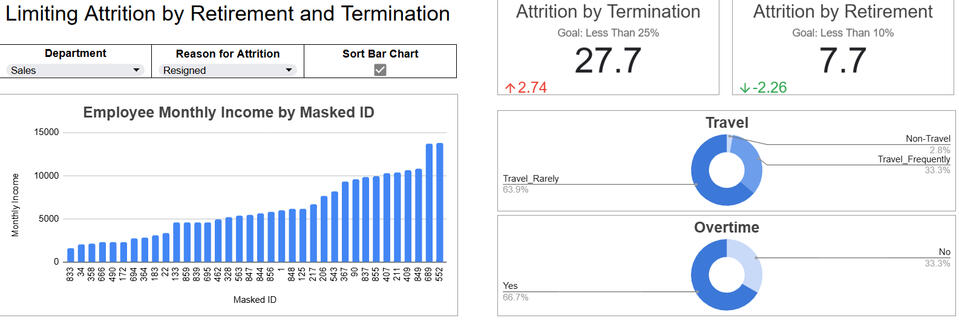
Project OverviewThis project uses a simulated employee attrition dataset to examine turnover related to retirement and resignation through an interactive dashboard built for practice in workforce analytics. The objective was to evaluate whether attrition rates aligned with company benchmarks while identifying patterns across departments and employee characteristics.Business GoalsThe dashboard was designed around two company performance goals:1. Keep attrition due to retirement below 10%
2. Keep attrition due to termination below 25%These benchmarks provide a simple way to measure workforce stability and identify areas where retention efforts may need improvement.Key Questions ExploredTo guide the analysis, I focused on several questions:* What percentage of attrition resulted from retirement?
* What percentage resulted from termination?
* Did the company meet its attrition targets?
* Were there noticeable trends related to business travel, overtime, or employee income?Data Preparation & WorkflowI began by importing and cleaning the CSV dataset to prepare it for analysis. After organizing the data, I used pivot tables to calculate key metrics and summarize attrition trends across departments. Interactive slicers were added to allow filtering by department and attrition reason, creating a more dynamic user experience.Dashboard DesignThe dashboard includes KPI cards, a bar chart, and donut charts to visualize attrition performance and supporting workforce trends. These visuals update automatically based on slicer selections, allowing users to explore different departments and compare attrition patterns quickly.Key FindingsThe analysis showed that the company successfully kept retirement-related attrition below the 10% target. However, termination-related attrition exceeded the 25% goal, suggesting an opportunity to further investigate employee retention and potential workplace factors contributing to turnover.Final ThoughtsThis project strengthened my experience with Excel dashboards, pivot tables, filtering logic, and KPI-driven reporting. It also reinforced the importance of presenting workforce data in a way that supports quick interpretation and business decision-making. View the full dashboard here.Thank YouThank you for taking the time to review my portfolio and explore this project. I appreciate the opportunity to share my work and welcome connections with teams interested in analytics, reporting, or data-driven problem solving.
Power BI
Iris Flower Analysis
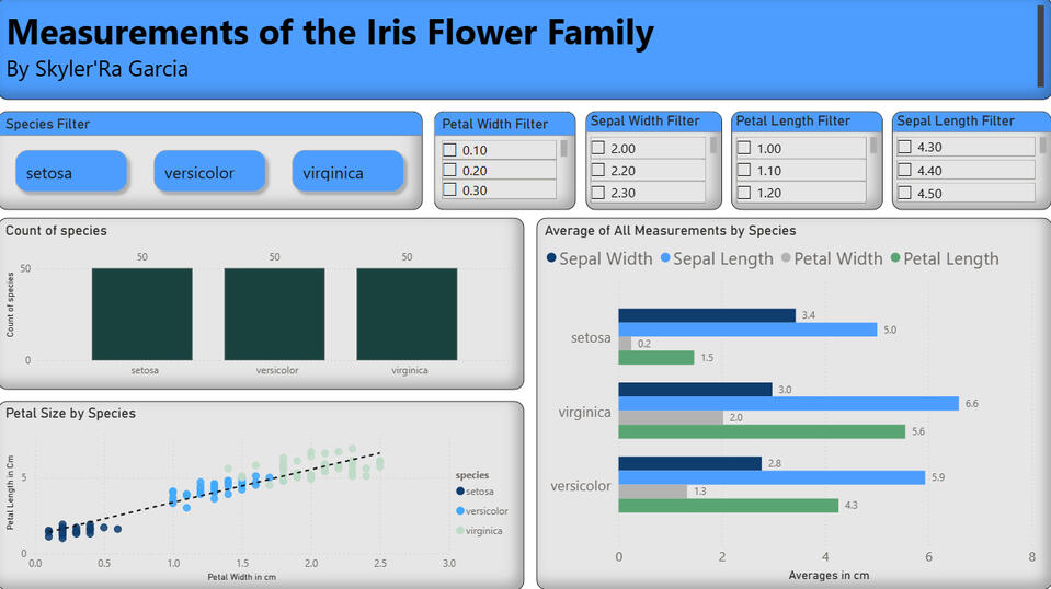
Project OverviewThis project explores the well-known Iris flower dataset through an interactive dashboard designed to compare measurement patterns across three flower species: setosa, versicolor, and virginica. The goal of the analysis was to better understand how petal and sepal dimensions vary between species while practicing dashboard design, filtering logic, and visual storytelling.ObjectivesThe dashboard was created to answer several key questions:* How do petal and sepal measurements differ across species?
* Which flower species has the largest or smallest average dimensions?
* Are there visible trends between petal width and petal length?
* How can interactive filtering improve exploration of measurement data?Data Preparation & WorkflowI began by importing and preparing the dataset to ensure measurement fields were properly formatted and categorized. After organizing the data, I created calculated summaries to compare averages across species and build supporting metrics for visualization.Interactive filters were added to allow users to isolate measurements by species and dimension ranges. This created a dynamic dashboard experience where charts update automatically based on selected criteria.Dashboard DesignThe dashboard combines multiple chart types to provide different perspectives on the data:* A species count chart to display distribution across flower categories
* A grouped bar chart comparing average sepal and petal measurements
* A scatter plot to visualize the relationship between petal width and petal length
* Interactive slicers that allow users to filter by species and measurement valuesThese elements work together to make the dataset easier to explore while highlighting relationships between flower characteristics.Key FindingsThe analysis revealed clear measurement differences among the three species. Setosa generally displayed the smallest petal dimensions, while virginica showed the largest overall measurements. The scatter plot also demonstrated a strong positive relationship between petal width and petal length, suggesting consistent growth patterns across species.Skills DemonstratedThis project strengthened my experience with:* Interactive dashboard creation
* Data filtering and slicer logic
* Comparative analysis
* Scatter plot trend interpretation
* Data visualization and storytelling
* KPI and summary metric presentationFinal ThoughtsThis dashboard provided hands-on experience translating raw measurement data into an interactive analytical tool. It reinforced the importance of visual organization, clear comparisons, and user-driven filtering when presenting data insights.
Excel
Penguin Body and Flipper Length
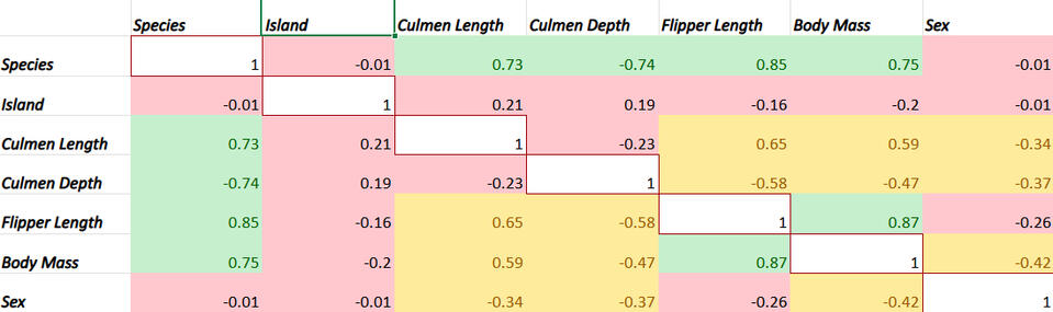
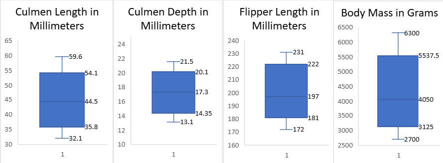
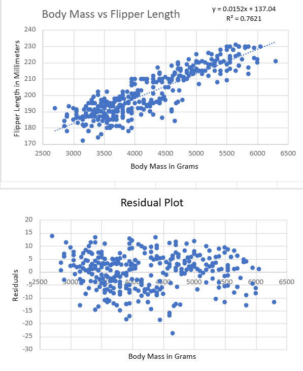
Project OverviewThis project explores the Palmer Penguins dataset to examine relationships between physical penguin characteristics through statistical analysis and visualization. The primary focus was identifying which variables shared the strongest relationship and determining whether the data was suitable for predictive modeling.ObjectivesThe analysis was designed to answer several key questions:* What was the overall quality and integrity of the dataset?
* Which variables showed the strongest correlation?
* How were the most strongly related variables distributed?
* Was the relationship strong enough to support linear regression analysis?Data Preparation & WorkflowI began by reviewing and cleaning the dataset to ensure consistency across measurements and remove missing values that could affect analysis. After preparing the data, I calculated summary statistics to evaluate central tendencies, spread, and overall dataset integrity.To better understand relationships between variables, I created a correlation matrix to compare measurement pairs and identify the strongest associations. Outlier detection methods were also used to evaluate data consistency and determine whether the dataset was appropriate for further statistical modeling.Statistical Analysis & VisualizationAfter identifying the strongest correlated variables, I created scatterplots to visualize their relationship and assess trend direction. A linear regression model was then applied to measure predictive strength between penguin body mass and flipper length.Additional calculations included:* Residual analysis
* Root Mean Squared Error (RMSE)
* Standard error evaluation
* Trendline interpretationThese methods helped determine how well the regression model fit the data and whether prediction error remained within a reasonable range.Key FindingsThe dataset demonstrated strong integrity with minimal missing data and no major outlier concerns. Flipper length and body mass showed the strongest positive relationship, making them suitable candidates for regression analysis.The results indicated a clear upward trend between the variables, with relatively low prediction error. Although the dataset size was moderate, the relationship between measurements supported the use of a simple linear model.Skills DemonstratedThis project strengthened my experience with:* Data cleaning and validation
* Descriptive statistics
* Correlation analysis
* Outlier detection
* Linear regression modeling
* RMSE and standard error interpretation
* Data visualization and statistical storytellingFinal ThoughtsThis analysis reinforced the importance of validating data quality before modeling relationships. It also provided hands-on experience translating statistical output into clear, visual insights that support interpretation and decision-making.To view the full project in Excel click here and for the accompanying report click here.